Black, grey and gold abstract art: a three-tone palette that holds up
Black, grey and gold abstract art holds up when grey does the quiet work between the other two: black sets the weight, gold stays the smallest share, and grey, in the painting or on the wall around it, softens the jump between them. Judge the painting in greyscale first, then check how the gold is made.
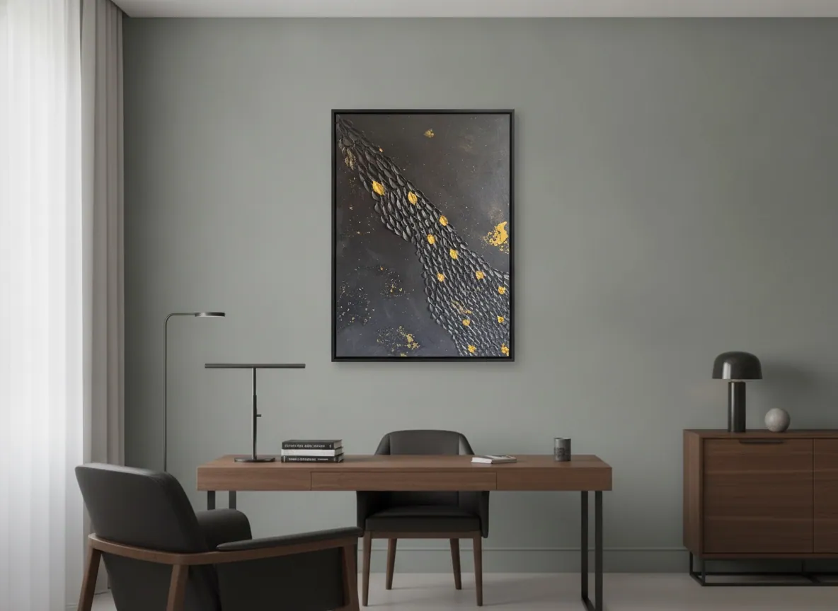
Grey is the mid-tone, and the mid-tone decides
Black and gold is a two-note chord: very high contrast, which many people read as formal. Add grey and the chord gains a middle voice. In painting terms, grey is the mid-value that sits between the darkest dark and the lightest light, and in our reading it often helps a dark, metallic picture feel resolved rather than staged.
The same structure appears in painting instruction. One widely used online lesson sorts every shape into "light, middle, and dark" families, says one family should dominate, and argues that getting the value pattern right "matters more than getting every color note perfect". Value is the structure; colour is the surface. A palette of black, grey and gold is almost all structure, which is why it can look so calm in a photograph and so different on a wall if the values are badly balanced.
This page is about that middle voice. The pairing of gold with black on its own is covered in gold and black abstract art and what it signals in a room, and the question of proportion with white in black, white and gold abstract painting.
The three-tone method: a five-minute check before you buy
The method is borrowed from the value studies painters make, turned around so a buyer can use it on a finished work.
- Convert the photograph to greyscale. The same lesson notes that hue can mislead the eye and that shapes which vanish in greyscale sit too close in lightness. If the gold disappears into the black or the grey, it is carrying colour but no structure.
- Name the leading tone. Is the picture mostly dark with a grey passage, mostly grey with dark accents, or evenly split? One tone should lead. When all three compete, the painting tends to look busy at a distance.
- Locate the gold. Gold is the accent, and in our reading it works best as the smallest share. Ask whether it sits on the dark area, where it stands out, or on the grey, where it quietly echoes.
- Look again from across the room. Squinting, or simply stepping back, blurs the detail into masses. The masses are what you will live with.
For a slower, more general way of reading a canvas, see how to look at an abstract painting.
What the studio's own works show, and what they do not
None of the works currently shown by the studio is strictly black, grey and gold, and it is better to say so than to stretch the description. What exists are close neighbours, each with imitation gold leaf (metallic leaf) according to the catalogue:
- Golden Passage (60 × 80 cm, mixed media, texture paste and imitation gold leaf (metallic leaf) on canvas, 2025, Archive ID AP-BNG-2025-001, R$3,500). A black field with a diagonal flow of sculpted forms and sparse fragments of gold. Depending on the light, the black may read closer to charcoal, so some of the grey comes from the light and the wall.
- Celestial Plan (50 × 70 cm, same technique, 2025, AP-BNG-2025-002, R$2,700). Fine concentric textures on a black surface, with scattered imitation gold leaf fragments.
- Origin of Light (60 × 80 cm, mixed media with acrylic and imitation gold leaf (metallic leaf) on canvas, 2025, AP-HOC-2025-002, R$3,300). The closest in the catalogue to this palette: its description speaks of deep gray tones with white and scarlet, and fragments of gold. Scarlet is an intruder in a strict black-grey-gold brief.
Dimensions are given width × height, and prices are stated in Brazilian Real as on each work's page.
Wall colour: let the grey be in the room
Because the painting is already dark and metallic, the wall decides how heavy it feels. In the studio's reading of walls, three arrangements tend to work:
- A mid-grey or grey-green wall. The painting's black reads as the dark end of a scale rather than as a hole in the wall, and gold becomes the only warm note. The digital mockup of Golden Passage on this page shows this arrangement.
- A pale warm neutral wall. The contrast is higher and the picture reads as a deliberate focal point, with the gold looking warmer next to the cream.
- A dark wall. Possible, but the black loses its edge. If you choose it, the gold carries the picture, so give it good light.
These are general principles of value and contrast applied to the works, not a rule. Metallic leaf is a reflective surface, so its brightness can change with the angle and the hour; look at the wall at the time of day you will be in the room most. Where to put a work with metallic leaf and how the light changes it is covered in our guide on where to hang a gold leaf painting.
Should the metal in the room match the gold?
Not exactly, but it should be decided. One interior-design guide on mixing metals advises two things: choose one dominant finish to anchor the room, and keep the total to no more than three finishes. The same guide describes warm metals such as aged brass as adding warmth and cool ones such as nickel and chrome as reading sleeker.
Applied to this palette: grey and black are cool-leaning, so a warm metal that echoes the gold, in a lamp base, a frame detail or a handle, ties the painting into the room. A cool metal elsewhere is fine as long as it is not competing at the same visual weight. A black frame, as in the digital mockup above, adds no new metal at all. The goal is for the gold in the painting to look intended, not stranded.
An original versus a print, for this palette
This palette depends on surface more than most. Texture paste can catch light from the side, and metallic leaf is a thin metallic layer, so an original can show relief and a shifting sheen that a flat reproduction may not convey. That is a practical difference rather than a moral one. If you are comparing, ask for photographs taken from several angles and in raking light, and ask what the gold is made of; in the studio's works it is imitation gold leaf (metallic leaf). Every original from the studio is sold directly by the artist with a signed Certificate of Authenticity, the technical record and the Archive ID.
From the studio
From the studio: grey is where the room comes in
As an architect I read a wall before I read a painting: its colour, where the window light lands, what stands against it. For the Black & Gold works, the black field and the imitation gold leaf are fixed, but the grey is never fully mine. It arrives from the wall, from the daylight and from the furniture around the piece. That is why I treat grey as a collaborator, and why I keep the gold sparse: light should appear sparingly, guiding the eye, rather than shouting across the room.
When someone sends a photograph of a wall, the first thing I look at is not the colour name on the paint tin but how light or dark the wall is next to the painting. A mid-tone wall gives the black somewhere to stand.
Frequently asked
What wall colour suits black, grey and gold art?
Mid-tone greys, grey-greens and warm pale neutrals tend to work best. A mid-grey wall lets the black read as the dark end of a scale and makes gold the single warm note, while a pale warm neutral raises the contrast and gives a more dramatic focal point. A very dark wall flattens the black, so the gold must carry the picture and needs good light. This is a general reading of value and contrast, not a fixed rule.
Should metal accents in the room match the gold?
They do not need to match exactly, but they should be chosen. One design guide suggests one dominant metal finish and no more than three in total. With a cool grey and black palette, one warm metal that echoes the gold, such as a lamp base or a handle, links the painting to the room. Other cool metals are fine if they carry less visual weight. A black frame adds no new metal at all.
What is the difference between buying an original and a print for this?
For a palette built on texture and metal, the surface matters. An original has real relief and, in the studio's works, imitation gold leaf (metallic leaf) whose sheen can shift with light and viewing angle, which a flat reproduction may not convey. Ask any seller for photographs from several angles and what the gold is made of. Originals from Perfeito Studio are unique, signed paintings sold directly by the artist.
How does Perfeito Studio ship an original painting?
The studio ships within Brazil and internationally. Shipping is quoted per destination, by postcode within Brazil, and is paid by the buyer, as are any import duties or taxes in the destination country. Professional packaging is included and transit insurance is available. Domestic delivery takes up to 15 business days depending on destination, and international shipping is quoted on request. Collection in person after purchase is also possible.
What comes with an original from Perfeito Studio?
Every acquisition is direct from the artist. It includes the original painting, a Certificate of Authenticity signed by hand with the full technical record and the internal Archive ID, a fiscal invoice or official receipt, an Artwork Acquisition Agreement covering ownership, copyright and image use, an artist dossier, conservation and care guidance, and professional packaging. The certificate carries a QR code linking to the work's official page.
Send us a photo of your wall
Tell us the wall colour and the light, and we will say which of the black and gold works holds up there, before any purchase decision.
Sources
- Online Art Lessons — 2026-10-11
- Nick and Alicia — 2026-10-11
Published on · Updated on