Abstract art for a coastal interior that is not blue and not beach scenes
For a coastal interior without blue or beach scenes, take the painting's colour from the room's sand, white and stone tones and keep the subject abstract: a warm ochre field, a tonal slate-and-brown surface, or one cool note. Livingetc says leaning on nautical references or every shade of blue can feel more costume-like than truly coastal.
Why a coastal room does not need blue, anchors or a seascape
It is easy to furnish a coastal room from a short list of cues and to choose the art from the same list. Two design publications push back on the nautical version of that shortcut. Livingetc, in a guide to coastal living rooms, says that reaching first for nautical references or every shade of blue can make a scheme feel more costume-like than truly coastal. Its example, the Fisherman's House by Studio Prineas, is built on black and cream base notes with russet and green accents. Kit Kemp Design Studio describes the classic coastal palette as shades of blue, crisp white, sandy neutrals and sea-foam green, and advises against excessive anchors and sailor stripes. Its guide also lists seascapes among the art that can reflect coastal life, so a literal seascape is a legitimate choice. This page is for the buyer who wants the other route.
A third source, a 1stDibs feature on beach houses, points the same way. In it, designer Damon Liss broadened the blue-and-white colour spectrum of a Wainscott, New York living room with a large, kaleidoscopic painting, and Philippa Thorp, designing a villa in the Bahamas, says: "Let the sea do the talking." The conclusion that follows is a design judgement, not something any of those sources states: where the sea, the light and the windows already supply the coast, the painting does not need to repeat them.
Take the colour from sand, white and stone, and keep the subject abstract
If the room's palette is sandy neutrals and crisp white, the painting can answer that palette without picturing anything. These three works from the studio's collection do it in different registers. Prices are in Brazilian real, set by the studio; dimensions are width × height.
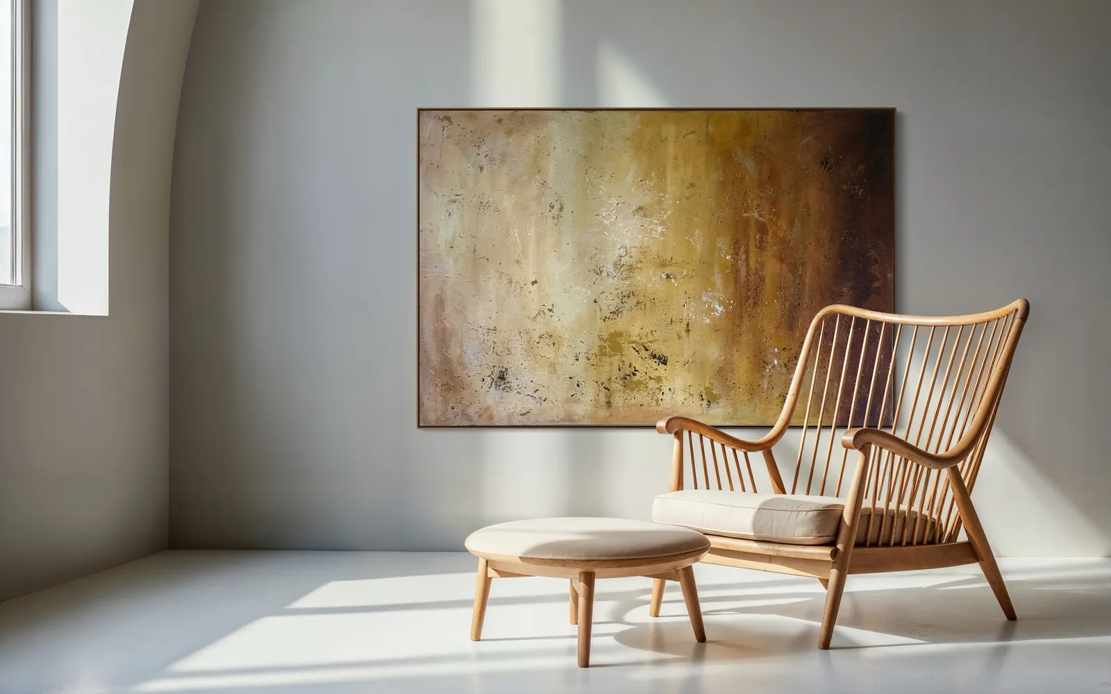
- Warm and sandy: Amber Strata (Terra & Ether, 2026; 150 × 100 cm; mixed media with acrylic on canvas; BRL 6,700). The catalogue text describes warm light pooling at the centre and deepening into ferrous browns toward the edges, built in horizontal passages of ochre, bone and oxidised umber. It is the closest of the three to sand and driftwood tones, although the work is about accumulation, not about a beach.
- Tonal and weathered: Patina Field (Terra & Ether, 2026; 100 × 100 cm; acrylic on canvas; BRL 5,200). Vertical panels of slate blue and iron brown stand beside a passage of ochre, with horizontal strata of white and deep blue along the lower edge. The catalogue text compares its surface to the weathering of an old façade. It brings some blue into the room without blue being the subject.
- Pale and quiet: Silent Interval (Matter & Silence, 2026; 120 × 160 cm; mixed media with acrylic on canvas; BRL 7,900). A warm bone-white field, one dark line descending through it and a single block of blue at the lower edge. It suits a white room that wants one decision on the wall rather than a colour scheme.
Which one fits is a matter of judgement about your room, not a rule: the pairing of each work with a palette above is the studio's reading, not a claim from the design sources.
If you want blue, choose it as climate rather than as subject
Blue is not forbidden in a coastal room; the point of the sources above is that blue alone is not the idea. Among the works that use blue without picturing water are two from the Luminous Rebirth series. Celestial Drift (Luminous Rebirth, 2025; 70 × 100 cm; acrylic on canvas; BRL 3,700) is described in the catalogue as a sky in transition, with diagonal currents of blue, ivory and deep indigo and openings of pale yellow. Veil of Light (Luminous Rebirth, 2026; 70 × 110 cm; mixed media on canvas with sculpted texture and acrylic; BRL 4,700) is described as atmospheric blue, with a single dark column and a figure of pale light rising through the indigo. Neither is a marine subject, and neither is presented as one here.
As a design judgement, a blue painting tends to work harder as the one cool note in a sandy, white or wood-toned room than in a room already assembled from blues. For how a cool painting behaves beside warm materials, see blue and teal abstract art for a living room.
A short way to decide, and what this page leaves to other guides
Start from what the room is made of. A sand-coloured, wood-toned or stone room asks for a warm or tonal field; a white room asks for one quiet decision; a room that already has a strong blue asks for something that is not blue. Then check the wall: the proportions for choosing a large piece against a sofa or console are in choosing a large abstract painting for a living room.
Salt air, sun through the glass, and what happens when a house sits closed for months are real questions for any coastal home, and they are covered in art for a beach house rather than repeated here. To see everything available, the gallery lists each work with its dimensions and price.
From the studio
From the studio
I trained as an architect before I trained as a painter, so I read a painting first as something that lives on a particular wall. Amber Strata is horizontal on purpose: its surface is built in horizontal passages of ochre, bone and oxidised umber, and at 150 × 100 cm it asks to be hung where the eye already travels sideways, along a long wall rather than up a narrow one.
It is not a seascape. Dark marks settle across the field like mineral debris, and flecks of warm gold catch the light; the subject is pigment settling into pigment, a record of time rather than a place. In a coastal room, a painting like that can sit beside the sand tones without describing the shore a second time.
Frequently asked
What abstract art suits a beach house?
Abstract art that takes its colour from the room's sand, white and stone tones and leaves the subject unpictured tends to suit a coastal house better than a literal beach scene. Warm ochre or bone fields, tonal slate-and-brown surfaces and one cool accent all work; this is a design judgement, not a rule. Livingetc notes that nautical references or every shade of blue can feel costume-like. Salt air, sun and months of closure are separate questions, covered in the studio's beach house guide.
Is blue the only colour for a coastal room?
No. Kit Kemp Design Studio lists blue among the classic coastal colours but alongside crisp white, sandy neutrals and sea-foam green. Livingetc shows a coastal house, the Fisherman's House by Studio Prineas, built on black and cream with russet and green accents. Blue can still be the right choice, particularly as one cool note in a warm room, but nothing in these sources makes it compulsory.
What is the difference between buying an original and a print for this?
An original is a single object painted by hand, while a print is a reproduction of an image. Every painting at Perfeito Studio is a unique original by Alyne Perfeito, with no editions or reproductions, signed by the artist and catalogued under an Archive ID. If a room needs a particular size or palette, the choice is among existing originals, each photographed in detail, rather than a file printed to fit.
How does Perfeito Studio ship an original painting?
The studio ships within Brazil and internationally. Shipping is quoted per destination, by postcode inside Brazil, and paid by the buyer together with any import duties or taxes in the destination country. Professional packaging is included and transit insurance is available. Domestic delivery takes up to 15 business days depending on destination. Most works ship unframed with finished edges. This text is informational and is not tax or customs advice; confirm with the customs authority or a broker.
What comes with an original from Perfeito Studio?
Every acquisition is made directly from the artist and includes a signed Certificate of Authenticity with the full technical record and Archive ID, a fiscal invoice or official receipt, an Artwork Acquisition Agreement, an artist dossier, care and preservation guidance, and professional packaging. The certificate carries a QR code linking to the work's official page, so provenance can be checked later.
Tell us what the room is made of
Send a photo of the wall and a line about the room's materials and light, and the studio will say which piece suits it before any purchase decision.
Sources
- Livingetc — 2026-10-10
- Kit Kemp Design Studio — 2026-10-10
- 1stDibs, The Study — 2026-10-10
Published on