How to choose abstract art colors for your sofa, rug and walls without matching them
Do not match the painting to the sofa. Let it share one or two notes with the room, and differ on purpose in the rest. Take the echo from smaller things such as wood, ceramics or a cushion, set the contrast against the large surfaces, and judge the result under the room's own light.
Why matching is the wrong goal
The instinct to match, a blue painting for a blue sofa, treats color as a fixed property of an object. It is not quite that. Josef Albers's Interaction of Color, a handbook and teaching aid for artists and students, originally published by Yale University Press in 1963, demonstrates principles such as color relativity, intensity and temperature [1]: a color is read against what sits beside it. A painting hung on a sage wall above a cream sofa is therefore not quite the painting you saw alone in a photograph.
Tate's glossary adds the other half of the idea. Complementary colors, which sit opposite each other on the color wheel, make each other look brighter when placed side by side [2]. A contrast chosen on purpose is a usable effect, not a mistake.
The working premise of this guide follows from both: a painting that repeats the sofa adds little the room does not already say. The more useful question is which one or two notes the painting shares with the room, and where it differs.
A method: one echo, one difference, and lightness checked separately
A method that fits on the back of an envelope:
- Name the large surfaces. Walls, sofa and rug set the field the painting will be seen against. Write each as a plain word ("sage", "cream", "charcoal and cream") and note whether it is light or dark, muted or vivid.
- Take one echo from the smaller things. Timber, a lampshade, a ceramic, a cushion. A note shared with a small element can tie the painting to the room without making it a copy of the sofa.
- Choose one difference on purpose. Let the painting bring a color, or a temperature, that the large surfaces lack.
- Compare lightness separately from hue. Art vocabulary separates hue (the everyday word "color"), saturation (the purity or intensity of a color) and value (its lightness or darkness) [3]. What follows is a working method, not a rule drawn from the sources: a painting can differ from the sofa in hue and stay close to it in value and saturation, which may read as a quieter pairing. If you want more drama, you can break one of the three on purpose rather than all of them at once.
A worked example: Patina Field against a sage wall, a cream sofa and a rug
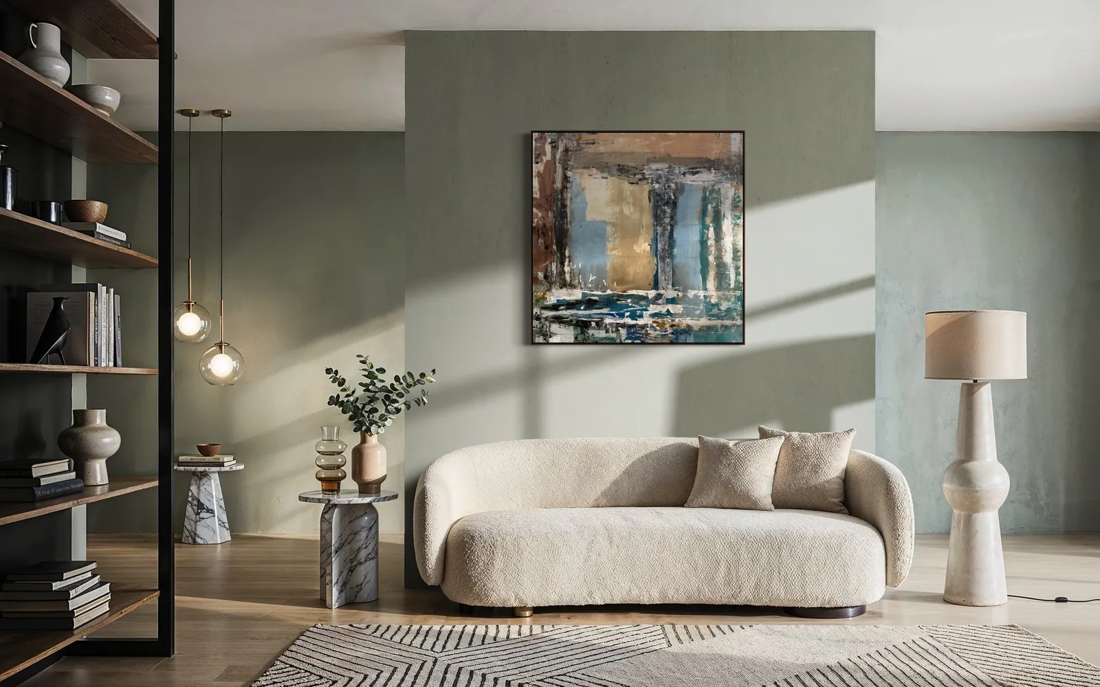
In the room scene at the top of this page, the wall is a muted sage, the sofa is cream bouclé and the rug is cream with charcoal lines. Patina Field (100 × 100 cm, acrylic on canvas, 2026) repeats none of them exactly. Its description lists vertical panels of slate blue and iron brown beside one ochre passage, with white and deep blue strata along the lower edge. The ochre can be compared with the warm tone of the timber floor, the slate blue is a cooler neighbor of the sage, and the rug's cream and dark lines can be compared with the white and deep-blue strata at the base. Nothing is copied, and several things are answered.
The scene is a mockup, an illustration of how the work reads in a room, not a photograph of a client's home. Treat it as a demonstration of the method, not as a prescription for these colors.
What the room does to the painting: neighbors, light and screens
Neighbors. As above, the wall and the sofa change how the canvas reads, so judge it against them, not alone. Light. The US Department of Energy notes that how the color of an object is perceived varies by light source, and that lamps are rated on a 0 to 100 scale for how accurately they render colors compared with an ideal or natural source, a rating known as the color rendering index [4]. In practice: look at the wall in the lamps you actually use in the evening, and in the daylight you actually get, before deciding. Screens. A photograph adds its own shift; our note on how accurate colors are when buying a painting online covers that separately.
Three common situations, and which works answer them
A patterned rug. A rug that already carries pattern may need less from the wall. A tonal work such as Patina Field, which its own description says settles a room rather than animating it, gives the eye somewhere to rest. A room that is all one temperature. If wall, sofa and rug are warm, a canvas that brings cool notes is a deliberate contrast, a choice rather than an accident. Amethyst Ground (100 × 100 cm, 2026) holds both temperatures in one square: warm terracotta and ochre below, cool violet and indigo above, so a room can pick up either. A warm, low-contrast room that wants a horizon. Amber Strata (150 × 100 cm, mixed media with acrylic on canvas, 2026, R$ 6,700) is a horizontal work in ochre, bone and oxidized umber; its format reads across a wall, which is one option above a wide sofa. Prices and dimensions on each work's page are the reference. For scale, see choosing a large abstract painting for a living room; to see how a purchase works, read how to buy a painting from Perfeito Studio.
From the studio
From the studio
I trained as an architect, and for an architect a room is large planes first and objects second. A painting is read against those planes, not against the sofa alone. Patina Field is the work I would use to explain this. I built it by applying pigment, scraping it back and applying it again until the surface looked worn rather than gestured, and what remains is slate blue and iron brown with a single ochre passage carrying the only warm light.
That is the general observation I would offer anyone choosing color: look for where the saturation is concentrated. A canvas with one warm passage in a muted cool field gives a room one place to answer, and the room can take it up through a lampshade or a floor, or leave it alone. A canvas with color spread evenly across it gives the room many places to answer, and may be harder to pair. Matching asks for a copy; this asks only for a conversation.
Frequently asked
Should art match the sofa?
Not exactly. A painting that repeats the sofa's color adds little the room does not already say. A more useful aim is partial agreement: share one or two notes with the room, preferably from smaller elements such as timber, ceramics or a cushion, and let the painting differ from the large surfaces in hue, temperature or lightness. Then judge it in the room's own light, since perceived color varies with the light source.
How many colors from the room should appear in the painting?
There is no fixed number, and none of the sources used for this guide gives one. As a working method, look for one echo and one difference: one color or temperature the painting shares with the room, and one it brings that the room lacks. If every color in the canvas can be found in the room, the painting may disappear into it; if none can, it may feel unrelated.
Does this guide apply to prints as well as originals?
It is written for originals. Every painting at Perfeito Studio is an original, unique and signed, painted on canvas, so the color you judge is the color of that one object. This guide makes no claim about reproductions. For buyers outside Brasília, additional detail photographs and video of a specific work are available on request through WhatsApp, which helps when you are comparing a canvas against a sofa and a rug you can see and it cannot.
How does Perfeito Studio ship an original painting?
The studio ships within Brazil and internationally. Shipping is quoted per destination, by postcode within Brazil, and is paid by the buyer, as are any import duties or taxes in the destination country. Professional packaging is included, and transit insurance is available. Domestic delivery takes up to 15 business days depending on destination; international shipping is quoted on request. Collection in person after purchase is also possible.
What comes with an original from Perfeito Studio?
Every acquisition is direct from the artist and includes the original painting, a Certificate of Authenticity signed by hand with the full technical record and Archive ID, a fiscal invoice or official receipt, an Artwork Acquisition Agreement covering ownership, copyright and image use, an artist dossier, conservation and care guidance, and professional packaging. The certificate carries a QR code linking to the work's official page.
What if my rug is patterned?
A patterned rug already carries a lot of visual information, so the wall may not need much more. A tonal painting, with muted colors and its saturation concentrated in one passage, may pair more calmly than a canvas with many strong colors. As a working habit, compare lightness as well as hue: if the painting is much lighter or darker than the rug, the pairing may read as more dramatic, whatever the hues. Photograph the wall with the rug in frame and judge from that.
Send a photo of the sofa, the rug and the wall
Tell the studio the colors you are working with and the width of the wall in centimeters, and it will say which work could echo one note and differ in another, or whether none does.
Sources
- Yale University Press — 2026-10-09
- Tate (Art Terms) — 2026-10-09
- LibreTexts Human Libraries, Coalinga College Drawing Basics — 2026-10-09
- U.S. Department of Energy (FEMP) — 2026-10-09
Published on · Updated on