Japandi interiors and abstract art: what fits, what clashes
Yes: abstract art suits a Japandi room when it is quiet, tactile and low in colour — a warm neutral field, a visible surface or trace of the hand, and at most one deep accent. What clashes is the opposite: saturated multi-colour compositions, high-gloss finishes and ornate frames that compete with the room's calm.
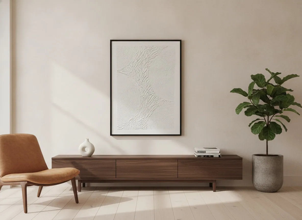
What a Japandi room asks of a wall
Japandi is the blend of Japanese and Scandinavian design. One trade source summarises it as Japanese Zen-minimalism joined to Scandinavian functionality, pairing the Scandinavian idea of hygge (comfort and cosiness) with the Japanese idea of wabi-sabi (finding beauty in imperfection). Its typical palette is muted and neutral — beige, tan, stone, oatmeal — with sparing accents such as pale green, deep indigo, dark grey or brown, and it leans on natural materials such as unfinished wood, paper, terracotta and wool.
Wabi-sabi is the idea of embracing beauty in imperfection. For a wall, that translates into three questions: is the colour restrained, does the surface show how it was made, and does the piece leave room around it?
Why abstract art usually fits better than a scene
A figurative picture brings a story, a face or a place into the room. In a space built on a few materials and a lot of empty surface, that narrative tends to become the loudest object. Abstraction can do the opposite: it can hold the wall at the same volume as the room. This is a design judgement rather than a rule, and there are Japandi rooms that carry a landscape well, but it is one reason restrained abstract work is a natural place to start.
Not all abstraction behaves the same way. Flat colour blocks and hard geometry read as graphic and can feel cold against wood and plaster. Work that records a gesture or a built-up surface sits closer to the wabi-sabi idea, because the imperfection is the point.
What fits: palette, surface, one accent
Two paintings in the Perfeito Studio catalogue show the qualities in practice. To be clear, neither is described as Japandi art; the point is which of their properties line up with the style.
- Echo of Silence (2025, Matter & Silence, sculpted texture on canvas, 50 × 70 cm, BRL 2,400, Archive ID AP-MAS-2025-002) has no colour at all: a white field worked into concentric reliefs and folds. It offers surface and calm without adding a competing hue, and its modest size suits a sideboard, a narrow wall or a reading corner.
- Silent Interval (2026, Matter & Silence, mixed media with acrylic on canvas, 120 × 160 cm, BRL 7,900, Archive ID AP-MAS-2026-003) is a vast field of warm bone-white crossed by one dark gesture, with a single block of blue near the lower edge. That is the one-accent structure the palette above describes, at a scale for a main wall.
For the wider logic of how large a piece should be for a given wall, see the guide to a large abstract painting for a living room.
What clashes
These are the studio's own design judgements, not rules set by a design body.
- Several saturated colours at once. Japandi accents are spare; a composition built on three or four strong hues competes with the room instead of joining it.
- High-gloss or mirror-like finishes. They bring a polished register that sits against the unfinished wood and matte plaster the style favours.
- Ornate or heavily carved frames. The style prizes plain materials; a plain thin frame, or none, keeps the wall consistent.
- Gold leaf as the main event. Metal leaf belongs to a different, more ornamental register. Our own Black & Gold series is built on it, and it is better placed in a room designed around contrast than in a pale, wood-toned one.
- Filling the wall. An oversized piece edge to edge removes the empty space the style depends on. One work with air around it usually reads better than a crowded group; how to look at an abstract painting covers why a quiet work rewards time.
Original or print for a room like this
Because the style rests on honest material and visible making, a surface that was physically built tends to matter more here than in a busier interior. A reproduction can carry an image; a sculpted relief like Echo of Silence is a physical surface, which a flat reproduction does not reproduce. Perfeito Studio sells originals only: each painting is unique, signed, catalogued under an Archive ID and sold directly by the artist. The steps are set out in how to buy a painting from Perfeito Studio, and the full catalogue is on the gallery page.
From the studio
Reading a pale wall as an architect
I trained as an architect, so I tend to read a wall as a surface that light crosses during the day. Echo of Silence is built as a sculpted relief in concentric folds on a single white, which is why it suits pale, wood-toned rooms: the only thing it asks of the wall is attention to the surface. If a room already has plaster, timber and a quiet palette, I would look first at a piece like this or at Silent Interval before reaching for anything with more colour.
Frequently asked
Does abstract art suit a Japandi room?
Yes, when it is restrained. Quiet abstraction with a warm neutral palette, a visible surface or trace of the hand, and at most one deep accent tends to sit well with wood, plaster and natural textiles. Busy, multi-colour or glossy compositions are what usually clash, because they compete with the calm the room is built to hold.
What colors work in Japandi art?
Muted neutrals such as beige, stone, oatmeal and warm white, with sparing accents like pale green, deep indigo, dark grey or brown. One strong accent is usually enough. Several saturated hues at once pull the eye away from the materials and the empty space that define the style.
What is the difference between buying an original and a print for this?
An original is a single, physically made object; a print reproduces an image. In a style that values handmade surface and imperfection, texture matters, and a sculpted relief cannot be carried by a flat reproduction. Perfeito Studio sells originals only. Each is unique, signed and catalogued with an Archive ID.
How does Perfeito Studio ship an original painting?
The studio ships within Brazil and internationally. Shipping is quoted per destination and paid by the buyer, as are any import duties or taxes in the destination country. Professional packaging is included and transit insurance is available. Domestic delivery takes up to 15 business days depending on destination; international shipping is quoted on request.
What comes with an original from Perfeito Studio?
Every acquisition is direct from the artist and includes the original painting, a signed Certificate of Authenticity with the technical record and Archive ID, a fiscal invoice or official receipt, an Artwork Acquisition Agreement, an artist dossier, conservation and care guidance, and professional packaging. The certificate carries a QR code linking to the work's official page.
Considering a piece for a pale, wood-toned room?
Send a photo of the wall and the light, and the studio will tell you which works suit it.
Sources
- Dunn-Edwards (Specs+Spaces blog, 7 June 2021) — 2026-10-09
- Dunn-Edwards (Specs+Spaces blog, 7 June 2021) — 2026-10-09
- Perfeito Studio (obras.json, studio-facts.json) — 2026-10-09
Published on