Abstract art for a mid-century modern interior: palette, wood tones and scale
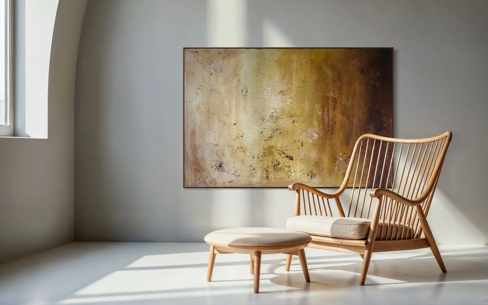
A mid-century modern room needs a painting that answers its wood, not one that copies its shapes. Choose an abstract with a warm note close to the furniture's tone, a textured surface to offset the clean lines, and a width near two thirds of the seating below it. Geometry is optional.
What the style asks of a wall
Mid-century modern is usually described as a style of design popular in the middle of the twentieth century, characterized by clean, simple lines and a lack of embellishment, most popular in North America, Brazil and Europe from roughly 1945 to 1970. It is also associated with an honest use of materials, meaning the grain of the wood or the weave of the fabric is shown rather than hidden.
That description is about the furniture and the architecture, not about the art. It tells you the room is already quiet and already linear: legs, planes, the edge of a sideboard. What it leaves open is the surface. A wall in this kind of room tends to want something that carries the one thing the furniture deliberately omits, which is a built-up, irregular, handmade surface. In practice this is why a textured abstract usually sits more easily here than a second set of hard lines.
Nothing in the definition requires geometric art. Period-flavored posters and strict grids are one reading of the look, but the more durable reading is restraint: few objects, each with a reason to be there.
Reading the wood tones before you choose a color
Start with the wood, because it is the largest warm area in the room. Walk up to the furniture and name its tone plainly: honey, red-brown, dark chocolate, pale blond. Then choose a painting whose warmest passage is a near neighbor of that tone, not an exact match. A painting that repeats the wood exactly tends to disappear into it; one that sits a step lighter, deeper or more mineral usually reads as a deliberate pairing.
It is worth remembering that the wood of the period is not one color. The Metropolitan Museum of Art records Charles Eames's "DCW" side chair of 1946 as birch plywood, with a ponyskin seat: a pale, light-toned wood. Period furniture ranges widely, so read your own furniture rather than a stereotype of the style.
- Honey and red-brown woods: ochre, bone and oxidized umber sit beside them without competing. Amber Strata (150 × 100 cm, 2026) is built from exactly those layers.
- Pale or blond woods: a cooler, quieter field can balance them. Patina Field (100 × 100 cm, 2026) pairs slate blue and iron brown with one passage of ochre.
- Very dark woods: look for a painting with a lighter, chalkier ground so the furniture keeps its edge.
Light changes all of this. In the studio's experience, a painting seen in warm late-afternoon light moves toward the wood, and the same canvas under cool midday light separates from it, so look at both before deciding.
Scale: low furniture, wide wall
Where a room is arranged around low, horizontal furniture, a horizontal canvas is a natural fit: it echoes the line of the sofa or sideboard instead of fighting it. A square or vertical piece can still work, especially to interrupt a very long wall, but check that it does not feel narrow above a wide seat.
For sizing and hanging height, the same proportional rule applies as for any seating wall; it is worked out in the guide to choosing a large abstract painting for a living room. As a starting point, aim for roughly two thirds to three quarters of the width of the seating, with the center near seated eye level, since that is where the painting is mostly seen from.
Space around the painting matters as much as its size. A restrained room is better served by one large piece with generous empty wall on each side. Crowding it with other frames works against the restraint that defines the look.
What a painting can and cannot do for the room
A contemporary abstract will not turn a room into a period interior, and it should not try. The works at Perfeito Studio were painted in 2025 and 2026; they are contemporary originals, and nothing here is a period piece or a reproduction of a period style. What they can do is share the qualities the style values: a limited palette, materials that show, and no ornament for its own sake.
Looking slowly helps. The guide on how to look at an abstract painting explains what to check on the surface, and the page on how to buy a painting from Perfeito Studio covers the steps from first message to delivery.
From the studio
From the studio
I trained as an architect before I painted, so I tend to read a room's lines first and its colors second. A room full of tapered legs and flat planes is a room that has already said a lot in straight lines. The painting is the place to say something different, with softness, depth and a surface that has been worked.
Amber Strata is the piece I would point to for a warm-wood room. It is built in horizontal passages of ochre, bone and oxidized umber, with dark marks settling across the field and flecks of warm gold catching the light, so the canvas reads close to a cross-section of sediment. Patina Field goes the other way: pigment applied, scraped back and applied again until the surface looks worn rather than gestured, in slate blue, iron brown and a single warm passage. Both are in the Terra & Ether series, and both are meant to settle a room instead of animating it.
If you are deciding between them, send a photo of the wall and the furniture. The wood tone is the first thing I look at.
Frequently asked
What art goes with mid-century modern furniture?
Art with restraint and a visible surface works best: a limited palette, a warm note close to the wood's tone, and some texture or layering to offset the clean lines of the furniture. Abstract paintings suit the look because they add no ornament of their own. Match the painting to the wood you actually have, since period furniture ranges from pale birch plywood to darker woods.
Do mid-century rooms need geometric art?
No. The style is usually defined by clean, simple lines and a lack of embellishment, and that describes the furniture and architecture rather than the art on the wall. Geometric work is one option. A textured, atmospheric abstract often sits more comfortably because it adds a handmade surface that the furniture deliberately leaves out.
What is the difference between buying an original and a print for this?
An original is the single physical painting, with its surface built by hand, so texture and layering are real and not reproduced. Every work at Perfeito Studio is a unique original, signed and catalogued with an Archive ID. In a restrained room, that physical surface is often what holds attention from across the space.
How does Perfeito Studio ship an original painting?
The studio ships within Brazil and internationally. Shipping is quoted per destination and paid by the buyer, as are any import duties or taxes in the destination country. Professional packaging is included and transit insurance is available. Domestic delivery takes up to 15 business days depending on destination, and international shipping is quoted on request.
What comes with an original from Perfeito Studio?
Every acquisition is direct from the artist and includes the original painting, a signed Certificate of Authenticity with the technical record and Archive ID, a fiscal invoice or official receipt, an Artwork Acquisition Agreement, an artist dossier, conservation and care guidance, and professional packaging. The certificate carries a QR code linking to the work's official page.
Not sure which tone fits your furniture?
Send a photo of the wall and the wood in the room, with the wall measurements, and we will tell you which painting suits it before any purchase decision.
Sources
- Wikipedia (extract via MediaWiki API) — 2026-10-11
- The Metropolitan Museum of Art (Open Access API record, objectID 483829) — 2026-10-11
- Perfeito Studio (internal catalogue) — 2026-10-11
- Perfeito Studio (internal facts file) — 2026-10-11
Published on