Neutral and beige abstract art for a living room: how to keep it from going flat
A neutral painting goes flat when it and the room around it sit at one value. Keep a neutral abstract from going flat by choosing one with a visible surface, a range of light and dark within its palette, and an undertone that agrees with the room. Livingetc makes the same point about neutral rooms.
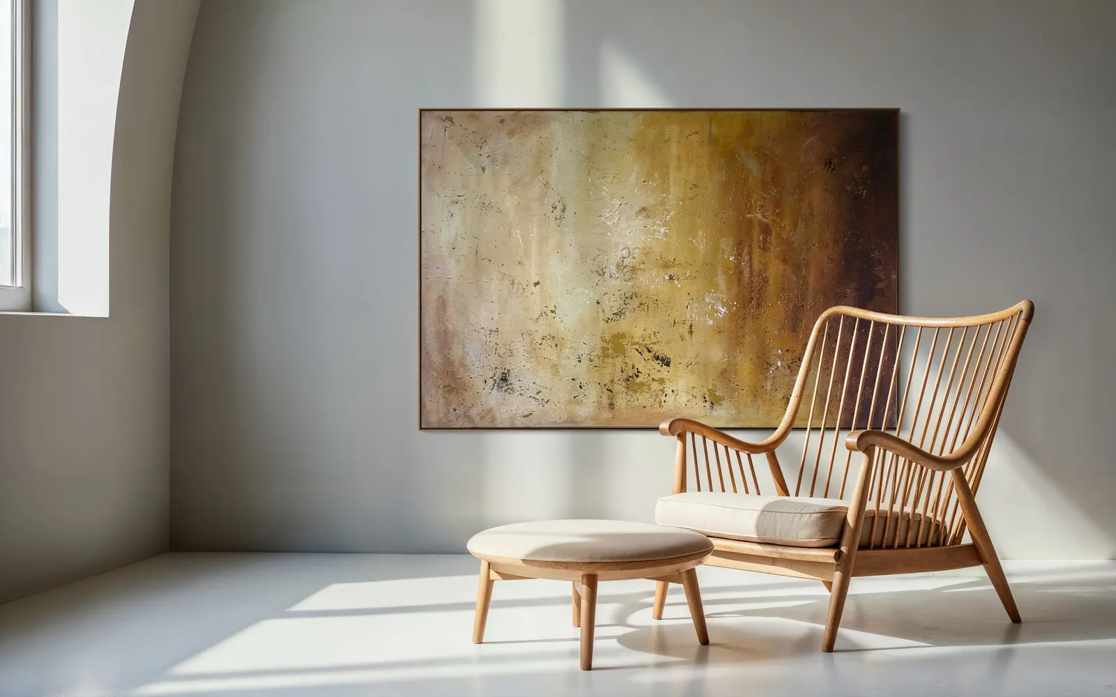
Why a neutral painting goes flat
Flatness is rarely about the colour being too quiet. It is about nothing changing. When the wall, the sofa, the rug and the painting share one value and one temperature, the eye has nowhere to travel, and the painting reads as another beige surface in a beige room.
Livingetc makes the same point about neutral rooms in general. The article quotes designer Emma Shone-Sanders saying that every neutral leans warm or cool and that contrast is what gives a neutral scheme depth. In its own voice, it lists depth, light and darkness, undertone, contrast, texture, form, proportion and materiality as what low-chroma rooms rely on for interest. A painting is one of the few objects in the room that can supply several of these at once.
Three things a neutral abstract needs
1. Value range inside a narrow palette. A painting that moves from bone through ochre to a deep umber has more to look at than one in a single flat beige, even though both are "neutral". The same article suggests light and dark contrasts, such as cream with walnut, to add dimension; a painting can hold that pairing on its own canvas.
2. A surface that changes with light. A surface with relief or layered paint reads differently as light moves across it, which is why it is worth judging in the room itself. Our guides on lighting a textured painting and on why texture reads differently in person go into this.
3. An undertone that agrees with the room. Warm neutrals (such as cream) and cool neutrals (such as dove grey) can be mixed, but one direction should lead. If the walls lean grey and the painting leans yellow, say so before you buy and judge it in the real room, not on a screen.
Which works in the studio are actually neutral
"Neutral" and "beige" are not the same thing, and the studio does not describe its works as beige. Three originals sit in the neutral range, each differently:
- Echo of Silence (2025, Matter & Silence, sculpted texture on canvas, 50 × 70 cm, R$ 2,400). A monochrome relief in concentric folds; its depth comes entirely from shadow, so it is neutral in colour and not at all flat.
- Silent Interval (2026, Matter & Silence, mixed media with acrylic on canvas, 120 × 160 cm, R$ 7,900). A warm bone-white field with one dark gesture and a block of blue; it is neutral in the field, not in the whole composition.
- Amber Strata (2026, Terra & Ether, mixed media with acrylic on canvas, 150 × 100 cm, R$ 6,700). Ochre, bone and oxidised umber in horizontal passages. This is the warmest of the three: an earth-neutral rather than a pale one.
Prices are as listed on each work's page, in Brazilian reais, and the page is the authority for availability.
Building the room around it
Because the painting supplies the contrast, the room can stay calm. In our experience, a light wall with a darker wood and a single dark or metallic note can be enough. Designer Sheena Murphy, quoted by Livingetc, points to oak and brass as ways to warm a cooler neutral space.
On size, in our experience, a neutral piece needs enough scale to register: a small canvas in a pale palette can disappear on a large wall. For proportions against a sofa, see choosing a large abstract painting for a living room, and for how to read a surface once it is on the wall, how to look at an abstract painting.
Original or print for a neutral palette
A print reproduces an image; an original is a surface. In a restrained palette the surface is most of what you are buying, because there is little colour to carry the work. Every acquisition from Perfeito Studio is an original, unique painting, bought directly from the artist, and comes with a signed Certificate of Authenticity carrying the Archive ID. For a wider comparison see original painting vs decorative print.
From the studio
What I look for in a quiet wall
I trained as an architect, so I read a neutral wall as a surface that light crosses during the day. In Echo of Silence, 50 × 70 cm, there is no colour change to follow, so I built the whole work from relief: concentric folds that throw shadow and make a single white behave like several. In Amber Strata, 150 × 100 cm, I worked the opposite way, letting ochre, bone and umber carry the depth in horizontal layers. Both are neutral, and neither is meant to disappear into the wall.
Frequently asked
What counts as neutral abstract art?
Neutral abstract art uses a restrained palette of whites, creams, greys, earth tones and blacks rather than saturated colour. Neutral does not mean beige: it can be warm or cool, pale or deep. What decides whether it works in a room is the undertone and the range between its lightest and darkest passages, not the label.
How do you add depth to a neutral palette?
Vary value, texture and undertone rather than hue. Livingetc's article recommends light and dark contrasts, such as cream with walnut, and treats texture and materiality as part of what low-chroma rooms rely on. A painting with visible relief or layered paint can contribute several of these at once, and it reads differently as the light moves through the day.
What is the difference between buying an original and a print for this?
In a neutral palette there is little colour to carry the work, so the surface matters more. An original is a unique painted object with a physical surface that catches light; a print reproduces an image. Every acquisition from Perfeito Studio is an original, unique painting, bought directly from the artist.
How does Perfeito Studio ship an original painting?
The studio ships within Brazil and internationally. Shipping is quoted per destination, by postcode within Brazil, and is paid by the buyer, as are any import duties or taxes in the destination country. Professional packaging is included and transit insurance is available. Domestic delivery takes up to 15 business days depending on destination; international shipping is quoted on request.
What comes with an original from Perfeito Studio?
Each acquisition includes the original painting; a signed Certificate of Authenticity with the technical record and internal Archive ID; a fiscal invoice or official receipt; an Artwork Acquisition Agreement; an artist dossier; conservation and care guidance; and professional packaging. The certificate is signed by hand and carries a QR code to the work's official page.
Considering a neutral painting for your living room?
Send a photo of the wall and the light, and the studio will tell you which works suit it.
Sources
- Livingetc — 2026-10-10
- Perfeito Studio (internal catalogue) — 2026-10-10
- Perfeito Studio (internal) — 2026-10-10
Published on · Updated on