Art for a wall with patterned wallpaper: does it work?
Yes, a painting can hang over patterned wallpaper, and the common rule is to contrast the scale of the art with the scale of the pattern: a busy print asks for a larger, simpler work with clear wall around it. A calm painting usually reads better than a competing one. Skip art when the wallpaper is itself the picture.
Yes, but the wallpaper sets the terms
Hanging art over patterned wallpaper is ordinary practice, and the advice from framers, galleries and decorators converges on one idea: make the two differ in scale. A busy print calls for a larger painting with breathing room around it; a very fine pattern gives you more freedom, and a bold, large-scale pattern can take one confident statement piece rather than several small ones.
The second idea is separation. Pattern bleeds into whatever sits against it, so a wide mat, a generous frame or simply a margin of bare wall around the work keeps the painting from dissolving into the print. Where the pattern is dense, that margin does more work than the choice of subject.
The advice is not unanimous. One online gallery guide goes as far as to say avoid pairing abstract works with busy wallpapers, while a retailer's guide recommends organic, irregular work precisely against geometric prints, so that the painting does not repeat the grid. The disagreement is useful: it tells you the question is less about abstract versus figurative than about how much each surface is asking of the eye.
Which paintings work: calm, bold, or neither
A workable way to choose is to ask what the wallpaper is already doing, then give the painting the opposite job.
- Large, bold motif: the painting needs visual weight of its own, or it will look like an afterthought. One substantial work usually beats a cluster.
- Fine, dense or intricate pattern: a simpler, quieter painting lets the eye rest; monochrome or restrained palettes are the usual recommendation.
- Colour: the safest route is to pull one or two colours that already exist in the wallpaper into the painting. The riskier route is a deliberate contrast, which works best with muted, considered tones rather than bright primaries.
In practice this is a spectrum between calm and bold, and both can fail. A calm painting that is too small is swallowed by the pattern. A bold painting with a lot of internal detail turns the wall into two busy layers competing for the same attention.
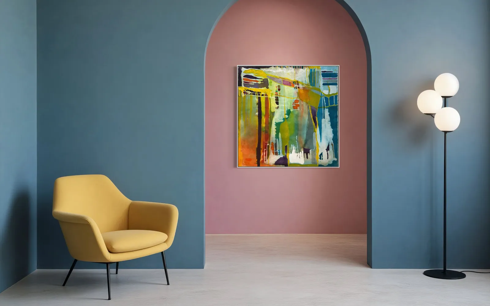
The catalogue gives a concrete pair. Silent Interval (120 × 160 cm, Matter & Silence) is mostly one warm bone-white field with a single dark gesture and a block of blue: its emptiness would offer a printed wall somewhere to stop. Prism Garden (100 × 100 cm, Luminous Rebirth) is built from layered translucent colour and vertical drips; against a patterned wall it would add a second dense layer, so it asks for a plainer surface.
Frame, margin and separation
Because patterned walls tend to swallow edges, the boundary of the painting matters more than usual. Framers recommend a plain mat or a wider frame to create a visible border, and decorators point to frames with depth (wood, metal, gilt or lacquer) and float-style mounts that lift the piece off the patterned backdrop.
A canvas does not carry a mat, so the separation has to come from elsewhere: the depth of the frame or edge, the painting's own ground colour, and above all the amount of wall left bare around it. A painting hung tight between a door frame and a corner, with pattern pressing in on all sides, loses its edges; the same painting with clear wall around it keeps them. It is the same logic as spacing in a group of works, covered in how much space to leave between paintings on a wall.
Light is the last variable. Glass-fronted frames can throw glare, and picture lights or spots are often used to bring out the layering between painting and wall, so look at both layers at the hour you actually use the room.
When to skip art altogether
Some walls are finished. A scenic or mural wallpaper, where the whole surface is one image, is often better left alone; if something must hang there, it is usually kept small and moved to a secondary spot. The same goes for a wall in a powder room or entry that was papered to be the statement of the space: the wallpaper is the art, and adding a second centre of attention subtracts from both.
Gallery walls over pattern need the most care and are the easiest to get wrong, because each frame multiplies the number of edges the eye has to sort out. If you want several works, give them a single rhythm (same frame, even spacing) or choose one larger piece instead.
And if you cannot say what the painting would add, the honest answer is a bare section of wall. Pattern needs quiet spots as much as a painting does.
How to test the combination before drilling
- Cut a template. Mark the painting's exact dimensions on paper or brown wrapping paper and tape it to the wall at the intended height. This shows scale and margin without commitment.
- Look at it from where you actually stand. Step back to the sofa, the doorway, the dining chair. A pattern that looks fine at arm's length can dominate across a room.
- Look again in daylight and at night. The room under artificial light is a different room, and the wallpaper may behave differently in each.
- Ask for detail views of the real work. The studio can send additional detail photographs, and video, of a specific painting on request, so you can judge the actual surface and colour, not just the catalogue image.
- Protect the paper. If you hang over wallpaper you want to keep, designers suggest removable hooks or tension systems for lighter pieces; for a heavy canvas, check the weight and the wall before choosing hardware.
From the studio
From the studio
I trained as an architect, and the habit that stayed with me is to ask what a surface is already doing before adding to it; a patterned wall is a surface with a job. Silent Interval, at 120 × 160 cm, is the painting I would reach for in that situation: most of it is a single warm bone-white field, and the one dark line has room to travel. It was composed for interiors that value calm and breathing room, and that restraint is what a printed wall tends to need beside it. It would not solve every wallpaper: against a very fine, tight print the pale field could simply read as a light rectangle, and a quieter wall would suit it better.
Frequently asked
Can you hang a painting over patterned wallpaper?
Yes. Hanging art over wallpaper is common, and the main guidance is to vary scale: a busy print needs a larger, simpler painting with space around it, while a fine pattern allows more freedom. The edge of the painting is what suffers on a patterned wall, so give it a margin of bare wall, a wide frame or both. The exception is a mural or scenic wallpaper, which often works better with no art in front of it.
Which paintings work with wallpaper?
Paintings that differ from the wallpaper in scale and in energy. A large bold motif wants a work with its own visual weight; a small, dense print is usually paired with a quieter painting, often with a restrained palette. Pulling one or two colours already present in the wallpaper is the safest way to link the two, and abstract work can give contrast against a geometric pattern, though not every guide agrees.
Should the painting be calm or bold?
It depends on the wallpaper, and either can fail. A calm painting that is too small disappears into the pattern; a bold, detailed painting can turn the wall into two busy layers. As a starting point, match calm to dense, fine patterns and give large, graphic patterns a painting with enough weight to hold its own. Whichever you choose, size it generously and leave clear wall around it.
When should you skip art on a wall with wallpaper?
When the wallpaper is already the focal point: a mural, a scenic print, or a bold paper chosen to be the statement of a powder room or entry. In these cases a painting competes with it. Gallery walls also deserve caution, since many frames add many edges against a busy background. If you cannot say what the painting adds, leaving some wall bare is a legitimate decision.
How can I test the combination before hanging?
Cut paper to the exact size of the painting, tape it to the wall at the intended height, and look at it from the places you actually sit and stand, in daylight and at night. Take a photo too. Ask for detail photographs or video of the real painting if you are buying remotely. Only then choose hardware, and use removable hooks if you want to protect delicate wallpaper.
Talk to the studio about a wall with pattern
Send a photo of the wall and the work you are considering, and talk it through directly with the artist on WhatsApp.
Sources
- UGallery — 2026-10-01
- Simply Framed — 2026-10-01
- Design Dash — 2026-10-01
- Fab Art — 2026-10-01
Published on