How to style art above a console or sideboard
Style a console or sideboard as one composition: a painting about two-thirds to three-quarters the width of the furniture, hung a modest gap above the top, with a few objects of different heights below it. The painting leads; the objects support it. In our experience, the middle of the gap is best left clear so the work can be read.
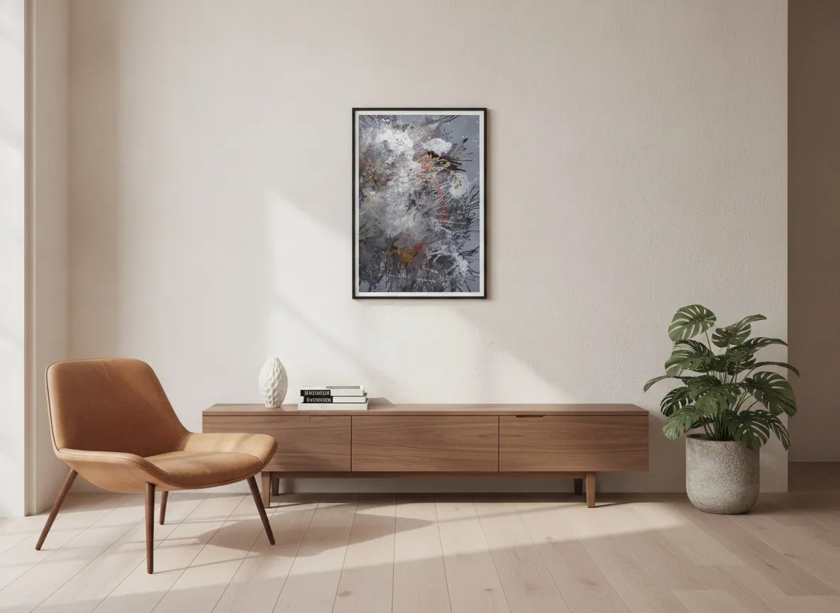
Start with width: the painting and the furniture are one unit
Two design references agree on the proportion: choose a piece about two-thirds to three-quarters the width of the console [1], and OKA likewise describes artwork spanning roughly two-thirds of the console's width [2]. In the atelier's experience, narrower than that and the painting tends to look lost above the furniture; at full width it can read as a slab.
In the collection, a 60 x 80 cm canvas such as Origin of Light therefore suits a console roughly 80 to 90 cm wide, while the horizontal Amber Strata, at 150 x 100 cm, belongs over a console of about 200 to 225 cm. The figures are simple arithmetic on the rule above, not a requirement. The sibling guide on hanging height covers the wall as a whole; this one concerns the furniture below.
The gap above the surface
The references differ slightly. Abrams Artists places the bottom of the artwork about 4 to 6 inches (roughly 10 to 15 cm) above an empty table, and raises that to 5 to 7 inches (roughly 13 to 18 cm) when decor sits on the console [1]. OKA suggests about 15 to 25 cm above the surface [2]. Taken together, the working range is roughly 10 to 25 cm, with the lower end for a bare top and the upper end when objects stand below the work.
The practical test is the one OKA gives: step back, and if the arrangement does not look right on the wall, rethink the size of the artwork [2].
What goes on the console
Vary the heights of the objects [2]. A common rule of thumb is a group of three, one tall, one medium and one low [3], with a high element balanced by a low, wide one [3]. In the image above, a small vase and a short stack of books sit to one side of the console, with a large plant on the floor at the other end; the painting stays clear of both.
Symmetry is optional. OKA describes symmetrical arrangements, with matching items at each end and a focal point at the center, and asymmetrical ones, which are more nonchalant and anchor one end with a large object, decreasing in size toward the other [2]. With a single painting centered above, an asymmetrical group below often keeps the composition from feeling stiff.
Hanging, or leaning
Leaning is the relaxed alternative: one source notes you can simply lean artwork against the wall above a sideboard [3], and another describes layered art as an easy way to refresh a display [4]. Hanging fixes the work at the height and position you chose; leaning lets you change it without new holes. The Portuguese guide to proportion above a sideboard covers the gap between the furniture and the work in more detail.
Vertical or horizontal
Most canvases in the collection are vertical; Amber Strata is the only horizontal one, and three works are square. A vertical work over a long, low console leaves empty wall on both sides, which is why the objects below matter more in that case: they extend the visual width of the piece. For a narrow console in a corridor, see choosing art for a narrow hallway.
From the studio
From the atelier
I trained as an architect before I painted, and a console is, to me, a base line: it fixes where the composition begins. Take Origin of Light, 60 x 80 cm, from Heart of Chaos. Its gold leaf and layered pigment are meant to be read at a few steps' distance, so I would keep the objects below it low and few, and let nothing tall stand directly in front of the canvas. If the console is wider than about 90 cm, a single piece of this size starts to look small, and that is the point at which I would look at a larger work in the collection instead.
Frequently asked
How high above a console should art hang?
Sources give slightly different ranges. Abrams Artists suggests 4 to 6 inches (roughly 10 to 15 cm) above an empty table and 5 to 7 inches when decor sits below. OKA suggests 15 to 25 cm. A working range of about 10 to 25 cm covers both, with the larger gap when objects stand on the console.
How wide should the painting be?
About two-thirds to three-quarters of the console's width, according to Abrams Artists, and roughly two-thirds according to OKA. On an 80 to 90 cm console, that points to a canvas around 60 cm wide. Measure the furniture rather than the wall, because the console is what the painting is paired with.
Can I lean art on the console?
Yes. One styling guide notes that you can simply lean the artwork against the wall above a sideboard, which suits a relaxed arrangement; another describes layered art as easy to refresh. Hanging gives a more fixed, composed result. Either way, keep the lower edge of the work clear of tall objects.
What objects pair with a painting?
Objects of varied height. A common rule of thumb is a group of three, one tall, one medium and one low, and a high element balanced by a low, wide one. Ceramics, books and a small lamp are typical choices. Keep them lower than the painting's bottom edge so they do not overlap the image.
Vertical or horizontal above a sideboard?
Both can work. A horizontal piece echoes a long, low sideboard and fills its width more easily. A vertical piece leaves space at the sides, which the objects on the surface can fill. In the collection, Amber Strata is the horizontal work; most others are vertical and three are square.
Send the console width and a photo of the wall
Tell the atelier how wide the console is and it will say which work in the collection fits, or whether none does.
Sources
- Abrams Artists — 2026-10-02
- OKA — 2026-10-02
- Style Curator — 2026-10-02
- Le Clair Decor — 2026-10-02
Published on